
Today is Blue Monday, which apparently means we are all supposed to feel a little gloomy just because the calendar said so. Rude. The color blue has been unfairly typecast for way too long. Sure, it can be moody, but it can also be playful, calm, fancy, nostalgic, and straight up happy. Blue is a multitasker.
If blue has been living rent free in your home as the sad color, it is time for a glow up. Let’s break down the kinds of blue art that bring joy, style, and personality into a space. No rain clouds allowed.
Cheerful blues that feel light and happy
Soft, lighter blues have a way of instantly lifting a room. These shades feel open, airy, and friendly, especially when paired with simple shapes or playful subjects. Instead of feeling heavy, this kind of blue feels fresh, like a clear sky or a quiet morning. It is the type of blue that makes a space feel welcoming and easy to live in.
This style works especially well when you want color without commitment. It brings joy without overwhelming the room and feels natural in spaces that are meant to feel relaxed and lived in. If your home leans bright, casual, or family friendly, cheerful blue art is basically the easiest yes.
- Pastel blue illustrations with animals or whimsical characters
- Light blue graphic art with clean, simple shapes
- Playful blue food art that leans fun and nostalgic
- Kids art that uses blue as a cheerful base instead of a bold statement


Elegant blues that feel calm and polished
Deeper blues have a completely different personality. Navy, indigo, and rich blue tones feel grounded, confident, and calm. This is blue showing its grown up side. These shades bring balance to a space and can make a room feel more intentional without feeling stiff or serious.
Elegant blue art works beautifully when you want a room to feel pulled together but still comfortable. It adds depth and richness without demanding attention, which makes it a great choice for spaces you use every day but still want to look a little bit fancy. Think “effortless” instead of “trying too hard.”
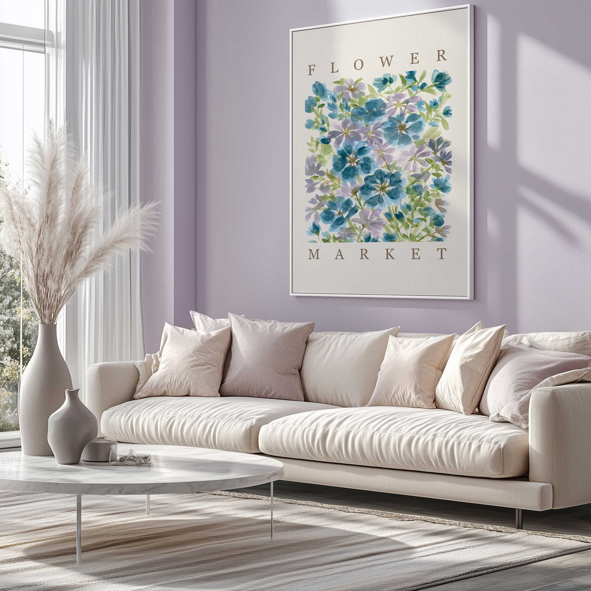
- Blue floral art with darker backgrounds and soft contrast
- Blue art with subtle gold or warm accents
- Classic still life or interior inspired blue artwork
- Painterly blue pieces that feel calm and refined

Bold blues that bring energy
Blue is not always quiet. Bright and layered blues can be full of movement and personality. When blue shows up in abstract art or expressive designs, it becomes energizing instead of soothing. These are the kinds of pieces that catch your eye and make a space feel more alive the second you walk in.
Bold blue art is perfect when you want one piece to do most of the talking. It adds confidence, creativity, and a little drama without feeling dark or moody. If your decor leans modern, eclectic, or you just want your walls to stop playing it safe, this is the section for you.
- Abstract blue art with layered colors and visible movement
- Bright turquoise or teal focused designs
- Modern blue art with pops of contrast
- Statement pieces that use multiple shades of blue together


Nostalgic blues that feel warm and familiar
Some blues feel like memories. Soft, slightly faded blue tones can bring a sense of comfort and familiarity to a space. This style often feels relaxed and personal, like something you have had forever even if it is brand new. Instead of feeling sad, these blues feel gentle and reassuring.
Nostalgic blue art works especially well when you want a space to feel cozy and collected rather than styled all at once. It pairs nicely with warm neutrals, natural textures, and little vintage touches. Basically, it gives your home that “come in and stay awhile” energy.
- Vintage inspired photography with soft blue skies
- Fair or travel themed blue artwork
- Retro designs with washed blue tones
- Art that feels casual, timeless, and easygoing


Romantic blues that feel dreamy
Blue can be emotional in the best way. When paired with florals, flowing forms, or soft painterly details, it becomes romantic and expressive. These blues feel thoughtful and intimate, creating a sense of calm that is comforting rather than cold.
This style is perfect for spaces where you want things to feel slower and more peaceful. Romantic blue art adds beauty and softness while still making a statement, especially when it mixes blue with warm tones like blush, cream, or muted gold. It is gentle, pretty, and quietly powerful.
- Floral focused blue art with soft contrast
- Dreamy painterly pieces with layered blue backgrounds
- Art that blends blue with blush, cream, or warm neutrals
- Expressive designs that feel calm and emotional


The real story about blue
Blue is not the problem. The stereotype is. Blue art can bring joy, balance, energy, and comfort into a space depending on how it is used. On Blue Monday and every other day, it deserves way more love than it gets. If you have been playing it safe with neutrals because blue felt risky, consider this your permission slip. Blue is not sad. It is versatile, beautiful, and very ready to shine on your walls. So go ahead, friends, give blue a chance to surprise you in the best way!