
February is the month of love, and while everyone else is focused on flowers, chocolates, and heart shaped everything, I’m over here thinking about color. Always. I can’t help it. Color has a way of pulling you in, setting a mood, and changing how a space feels without you even realizing it. And when it comes to wall art, color is usually the first thing that makes you stop and say, oh, I like that.
I am obsessed with blue and pink jewel tones, and my home reflects that. Maybe it’s the grey winter days, or maybe I just need a little extra warmth right now, but those deep, rich colors feel comforting and bold at the same time. They’re dramatic, sure, but also cozy, which feels like the perfect combo in February. That said, every color palette has its own kind of magic, and the fun part is figuring out which one you’re crushing on.
Pastel Art
Pastels are soft, easy, and kind of effortless. They feel light and happy without being loud, and they bring a calm energy into a room that’s really easy to live with. I always think of pastel art as the kind of piece that makes a space feel a little more relaxed, like everything just breathes better. It’s subtle, but it still adds color in a really thoughtful way.
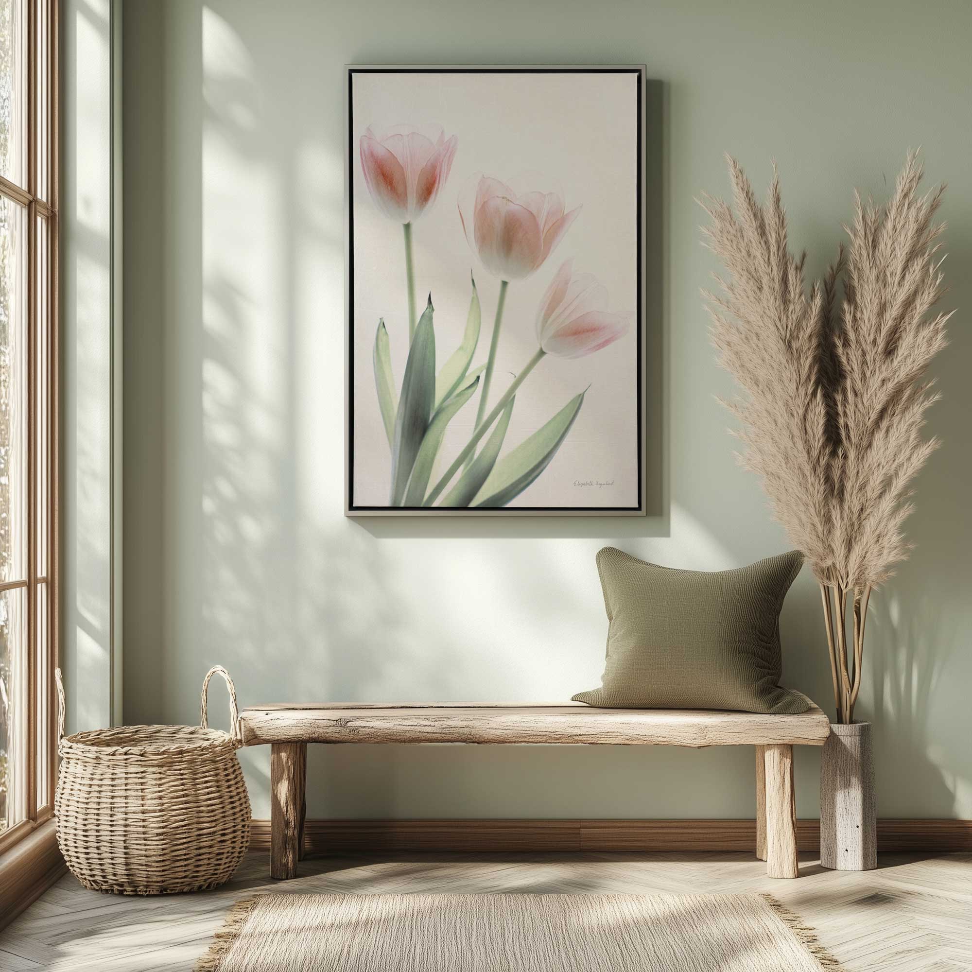

- Light and gentle colors
- Calm, fresh feeling
- Easy to mix with other shades
Black and White Art
Black and white is one of those palettes that never really goes out of style. It’s simple, but it still has a lot of impact. What I love about black and white art is how focused it feels. There’s nothing extra going on, so your eye goes straight to the subject. It’s clean, confident, and works just about anywhere.
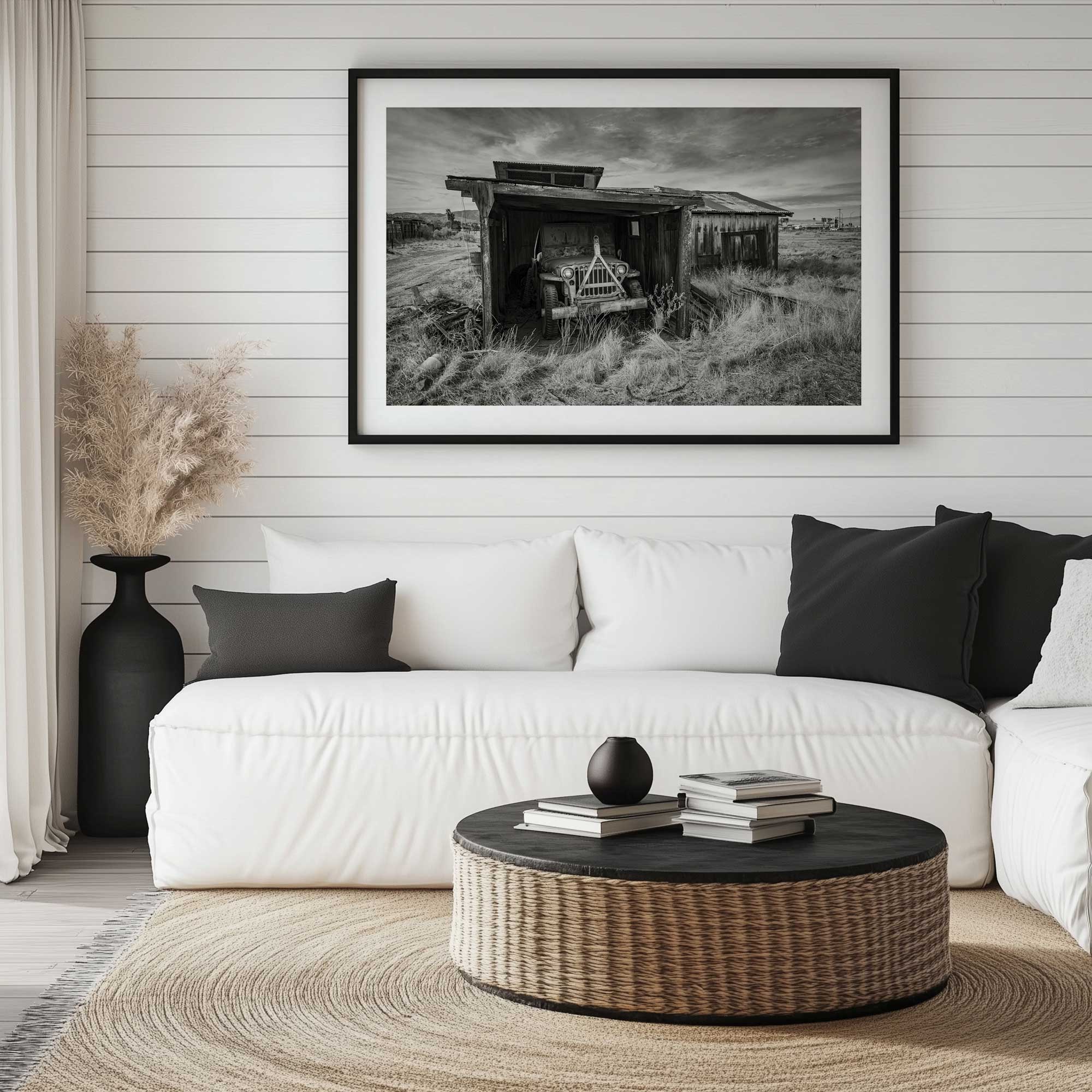

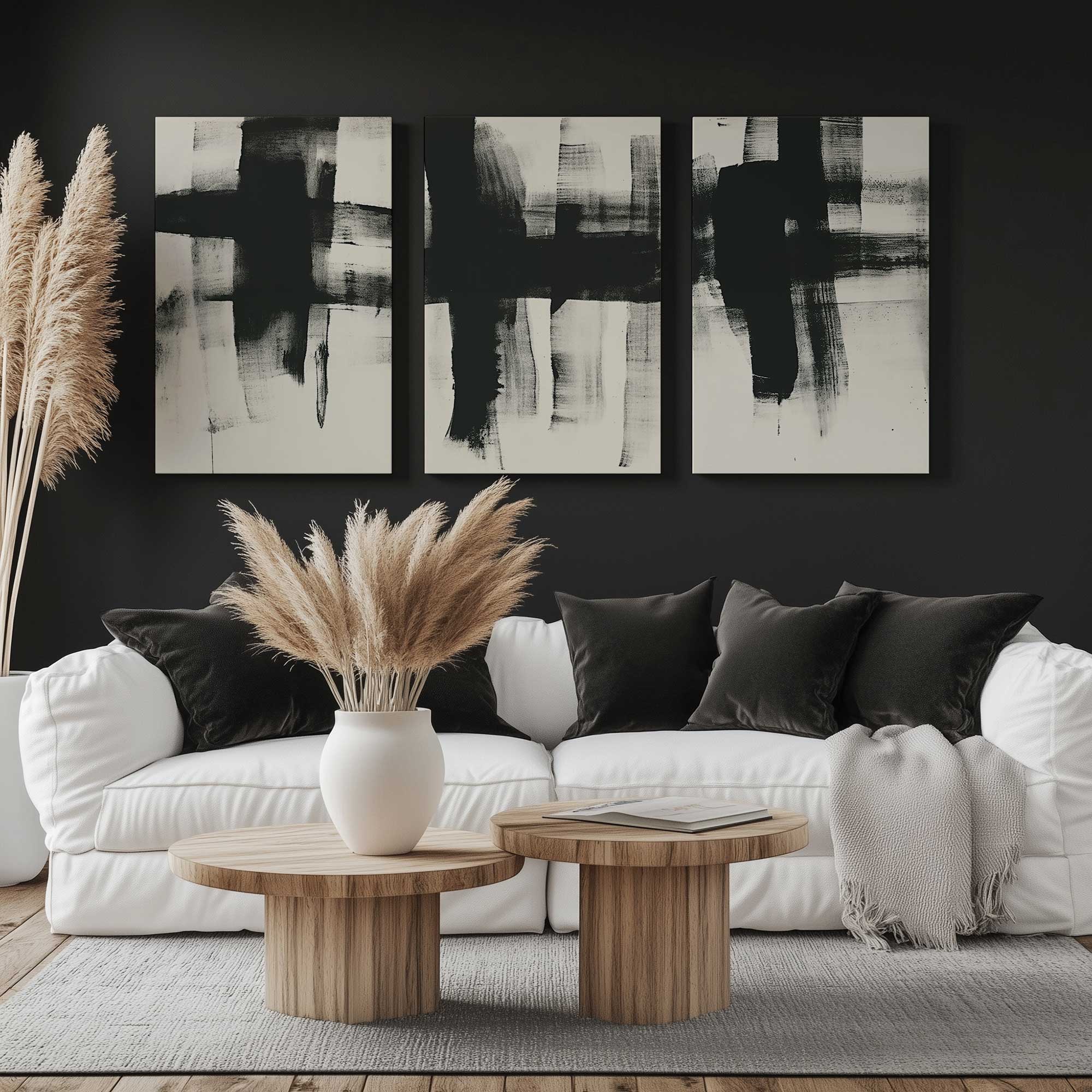
- Clean and classic
- Strong contrast
- Always feels intentional
Bright Art
Bright colors are pure fun. They’re bold, playful, and full of personality, and they don’t try to blend in. Bright art has a way of waking up a space instantly. It brings energy, movement, and a sense of joy that’s hard to ignore. If you love color and want your walls to show it, this palette is probably calling your name.
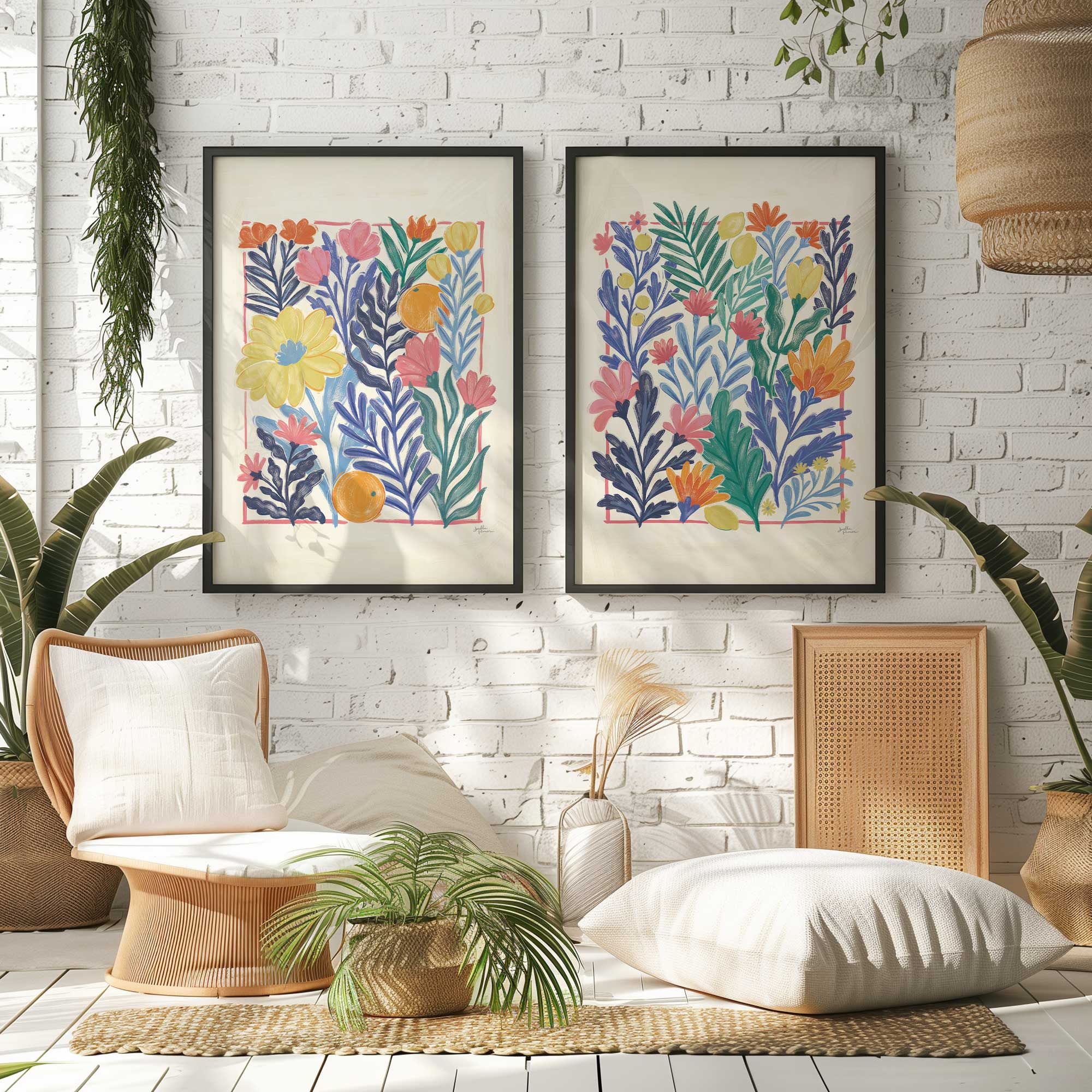

- Fun and energetic
- Makes a statement
- Full of personality
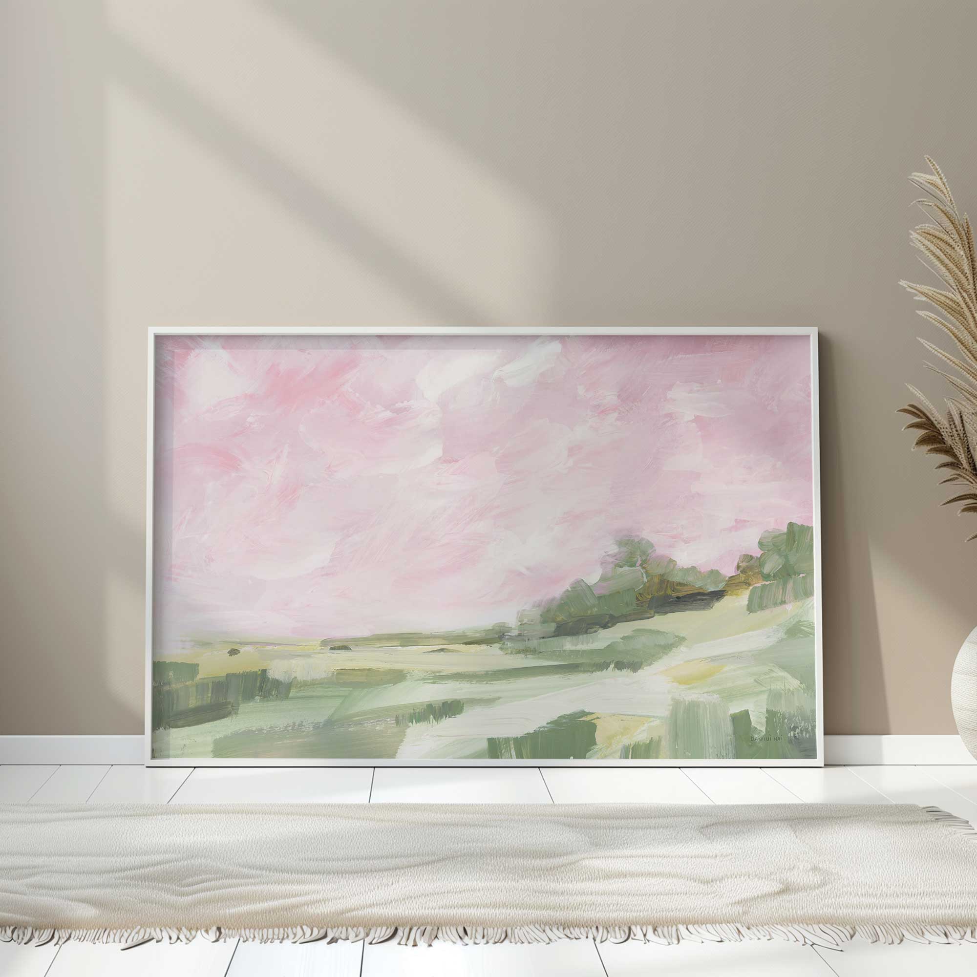
Earth Tone Wall Art
Earth tones feel warm and grounded, like they’ve always belonged. These are the colors that make a space feel cozy and lived in. I love earth toned art for how comforting it feels. It’s calm, natural, and easy on the eyes, which makes it a great choice if you want your space to feel relaxed and welcoming.
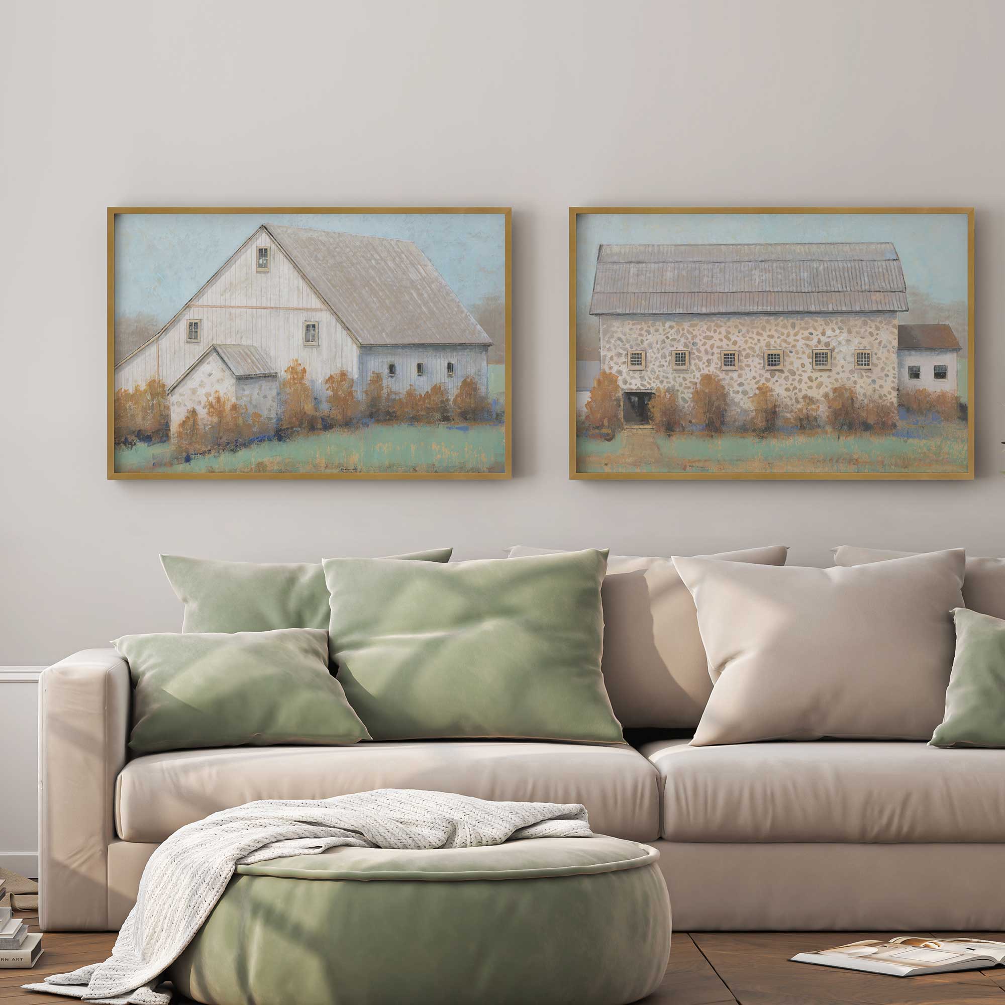
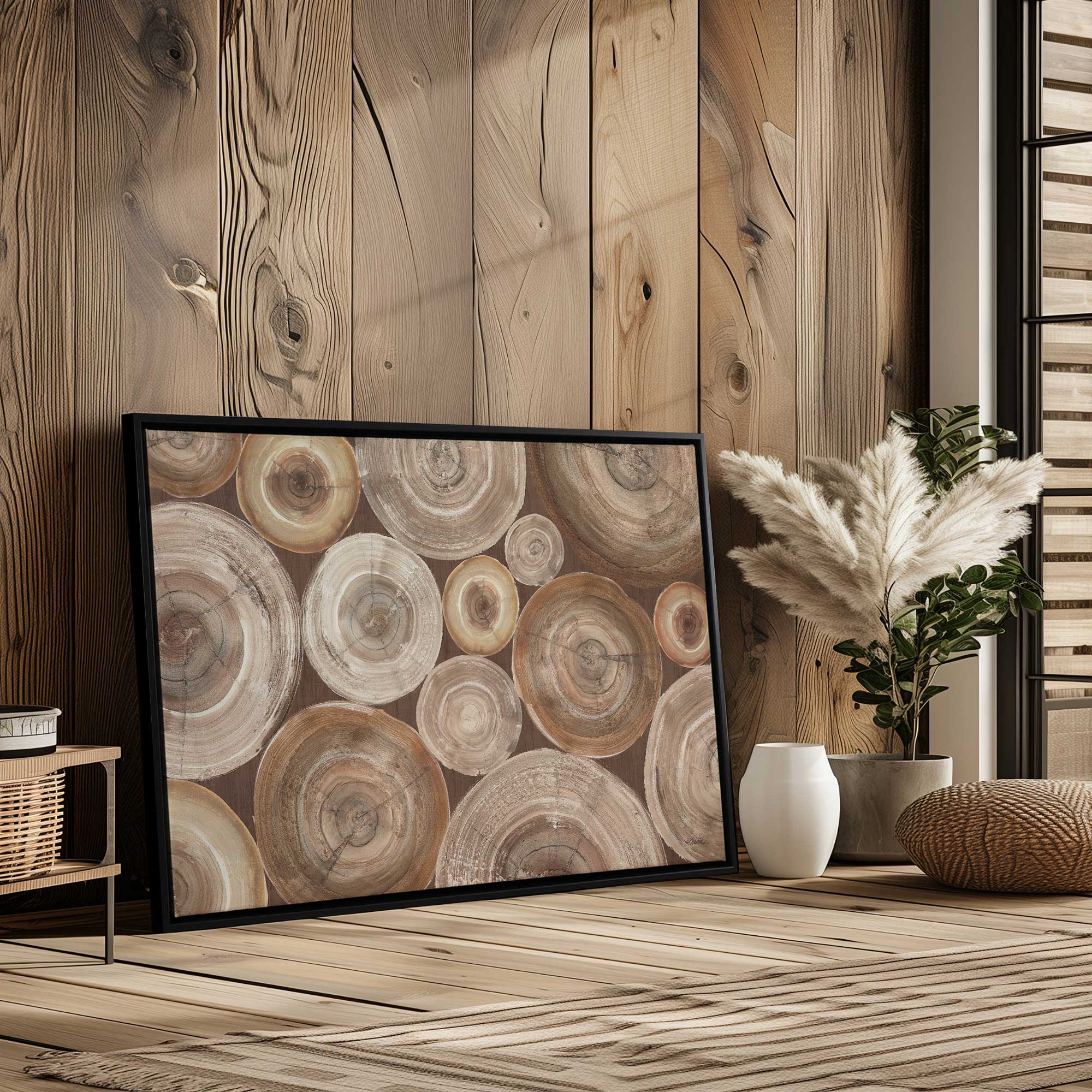
- Warm and natural colors
- Calm and grounding
- Easy to live with
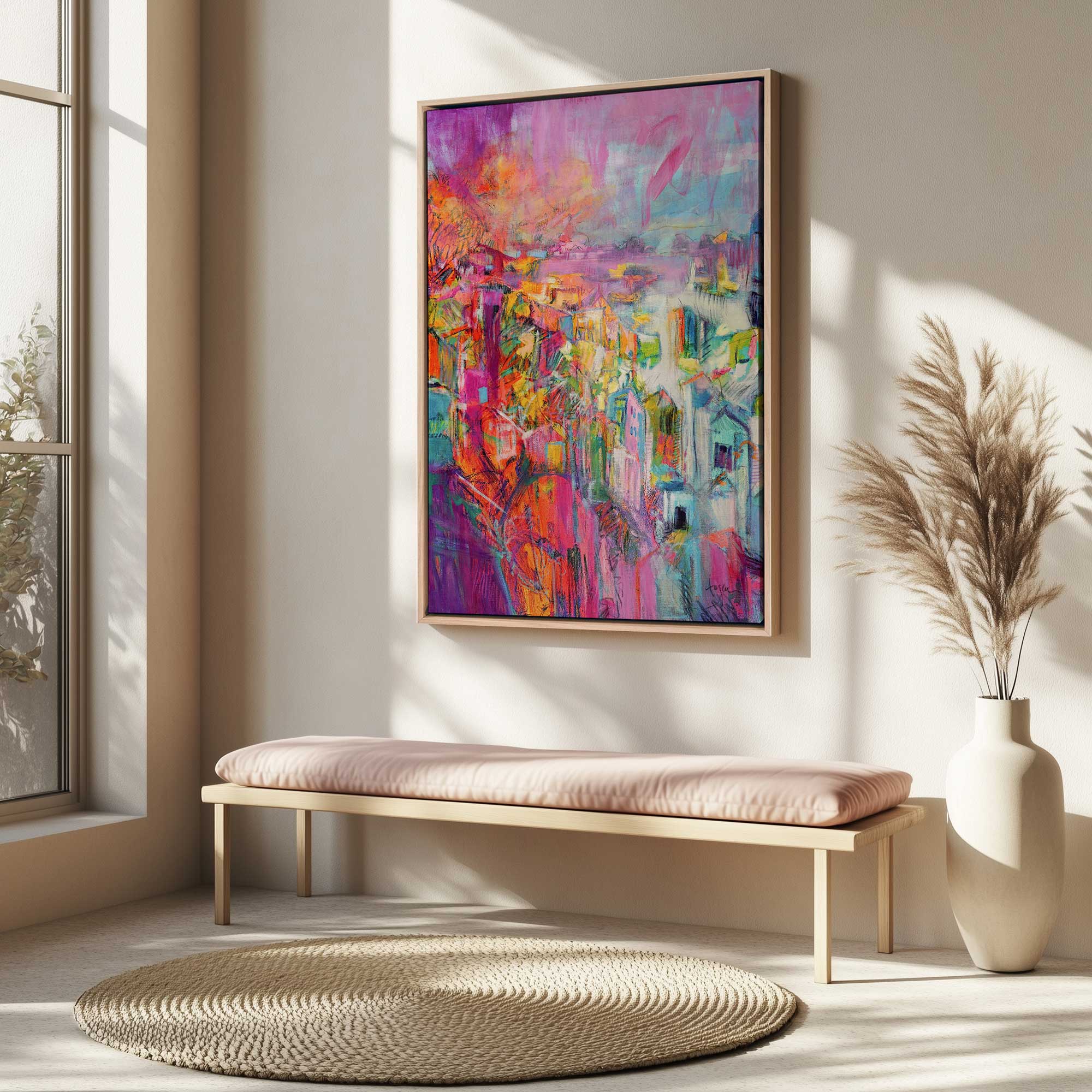
Jewel Toned Art
This is where my heart really lives. Jewel tones are rich, deep, and a little bit moody, in the best way. There’s something about these colors that feels both bold and comforting. Jewel toned art adds depth and warmth, especially when everything outside feels cold and dull. It’s the kind of color that makes a space feel finished.


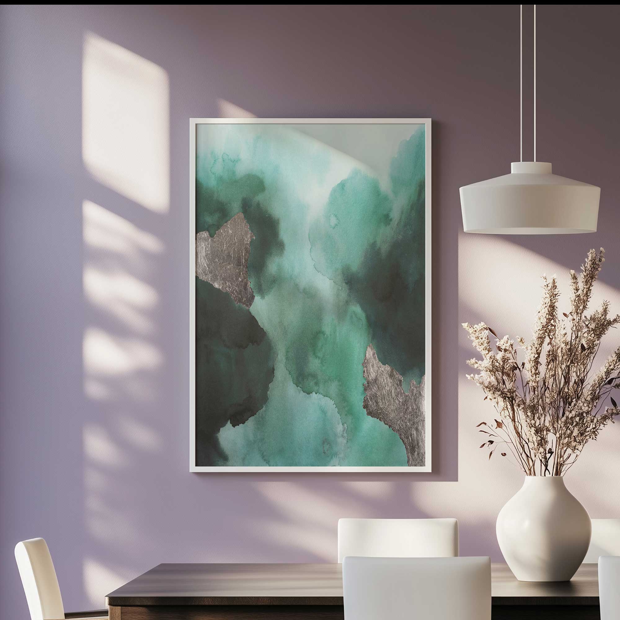
- Rich and saturated colors
- Cozy with a dramatic edge
- Timeless and bold
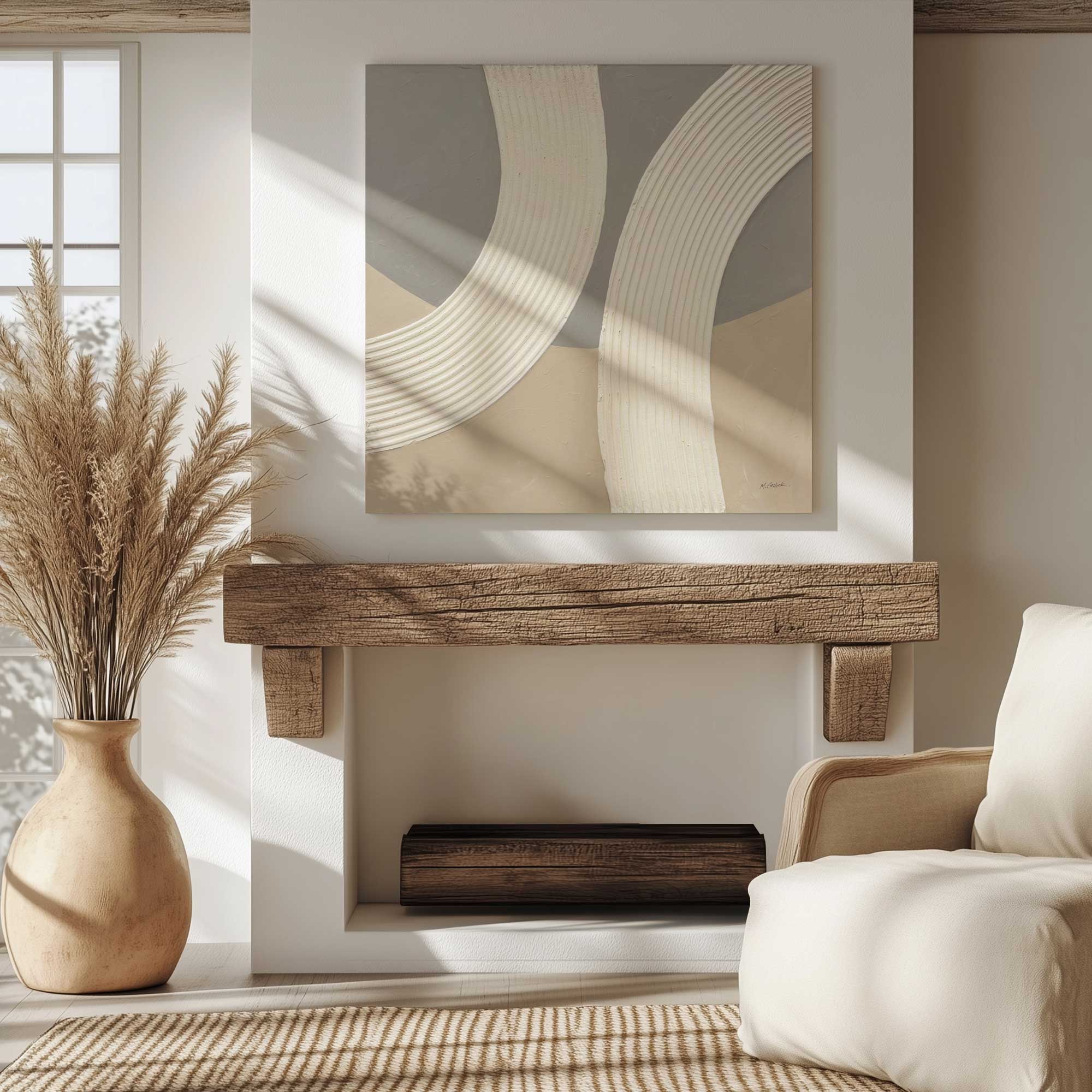
Neutral Art
Neutrals might not be flashy, but they’re quietly powerful. They create balance and let everything else shine. Neutral art feels calm and effortless. It doesn’t try to steal the spotlight, but it ties a space together in a really satisfying way. Sometimes, simple really is best.


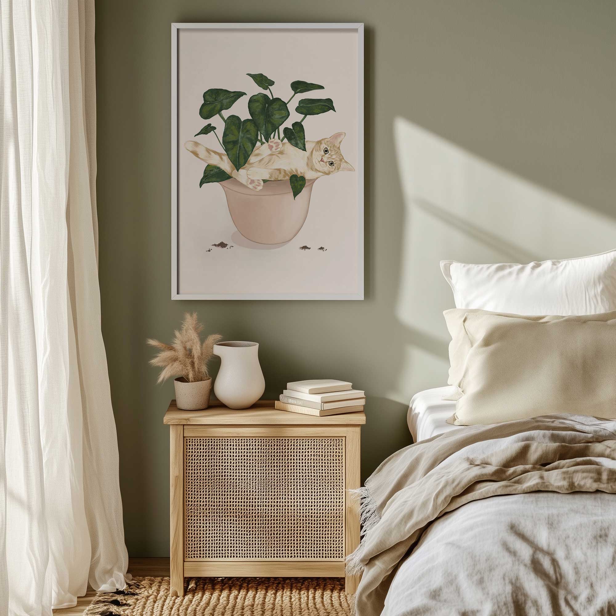
- Calm and balanced
- Easy to style
- Never feels outdated
So, What’s Your Color Crush?
At the end of the day, there’s no right or wrong choice. The best color palette is the one that makes you feel something when you see it. Maybe you’re drawn to soft pastels, maybe you love bold brights, or maybe, like me, you can’t get enough of those rich jewel tones. Whatever you’re crushing on right now, lean into it. February is all about love, after all, and your walls deserve a little of it too. For more inspo check out our Pick your Palette page. Until next time, friends, keep following your color crush!